Plumes — Elegant Brand Identity for a Scented Sanitary Pads Brand
Elegant and modern brand identity for Plumes, combining pastel tones and subtle design details for a premium look.

Plumes wanted a brand identity that balanced softness with modern sophistication. I began with moodboards and logo sketches, exploring how minimal design elements could convey elegance. The final identity included a clean logomark, harmonious pastel palette, and consistent social media templates. The result is a premium yet approachable visual style that resonates with Plumes’ audience and reflects its refined brand ethos.

I strategically developed the Plumes brand identity around a soft yet confident visual system that highlights elegance, femininity, and bold self-expression. My research phase involved studying beauty and lifestyle competitors to identify design trends and gaps where Plumes could stand apart. From there, I created a visual language that combines minimal elegance with a fresh, modern appeal, ensuring the brand feels aspirational yet relatable.

Logo
The logo development process shows a deliberate refinement from the initial sketch to the Final Logo. The icon—a feather (plume) combined with a gentle wing structure—was chosen to symbolize lightness, freedom, and protection. The evolution showcases the graphic design thought process, moving from rough concepts to polished line art and final color application, ensuring the mark is clean, instantly recognizable, and conveys a feeling of soft movement

During the initial research, I studied visual identities of modern lifestyle and beauty brands. I found that many leaned either too minimal (lacking warmth) or too bold (lacking elegance). This insight shaped Plumes’ positioning as a brand that merges softness with strength. By building a consistent visual system — from logo and packaging to social media creatives — I ensured Plumes communicates both aesthetic elegance and strategic clarity across all touchpoints.

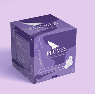
📦 Packaging
The packaging strategy demonstrates the application of the unified brand identity to the final product. Different scent profiles (Peach and Lavender) are assigned distinct, yet harmonious, color pairings from the core palette (purple/lilac and coral/peach). This ensures product differentiation while maintaining a cohesive family look. The use of a minimalist layout, elegant typography, and the refined plume icon on the packaging establishes a sophisticated, aspirational presence on the shelf